Thoughtful products.
Down to the details.
I’m a full-stack engineer with a frontend focus. I like working through how something should feel to use, then building it.
See my work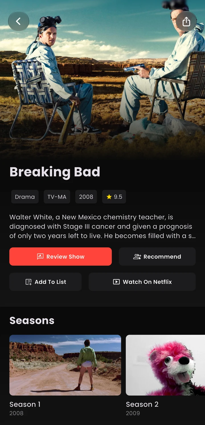
Reelate.
Keeping up with
what friends watch.
College made it harder to keep up with what my high-school friends were watching. That’s why I started Reelate. I’m the founder and the sole engineer.
A rating shouldn’t
need a keyboard.
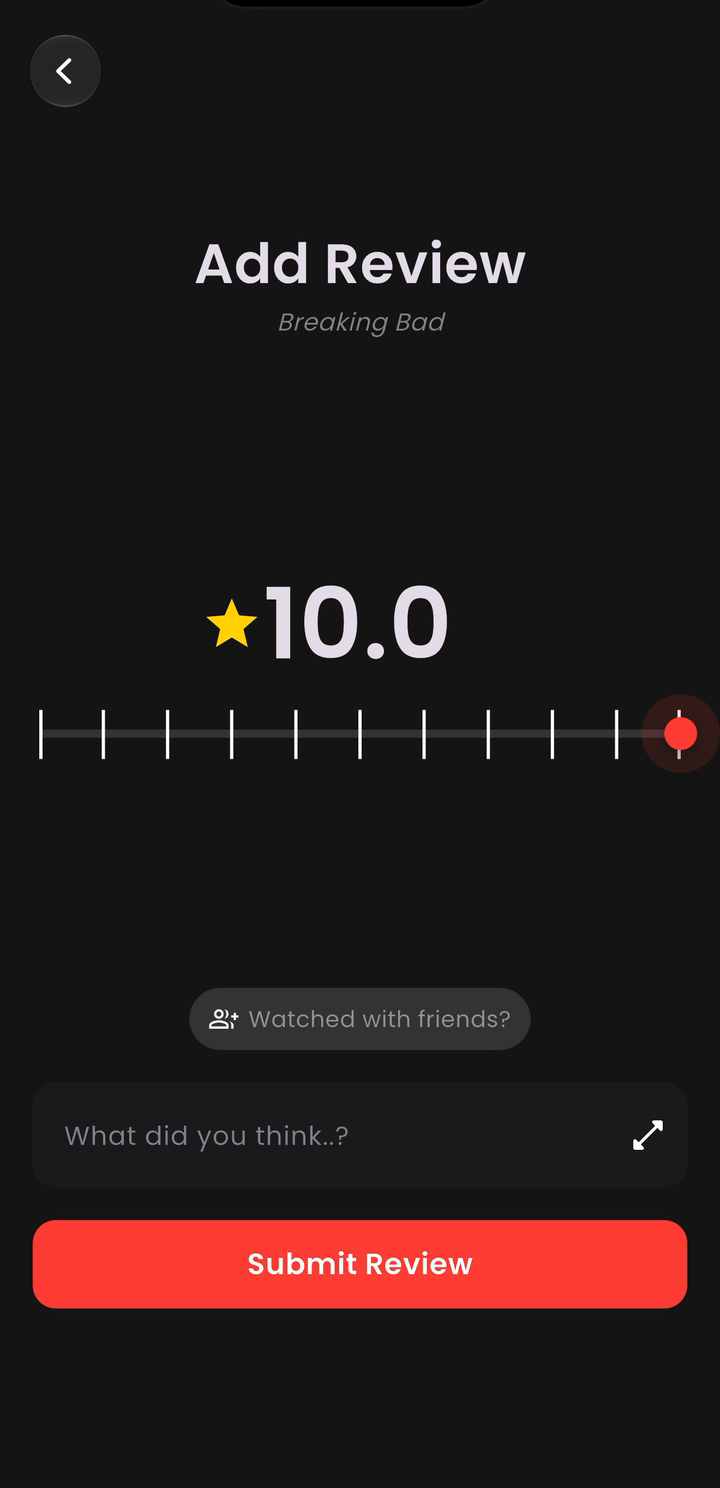
I wanted people to have plenty of control without making a quick opinion feel like work. The slider lets them pick a score in one gesture, and the haptic feedback makes it feel tactile and enjoyable.
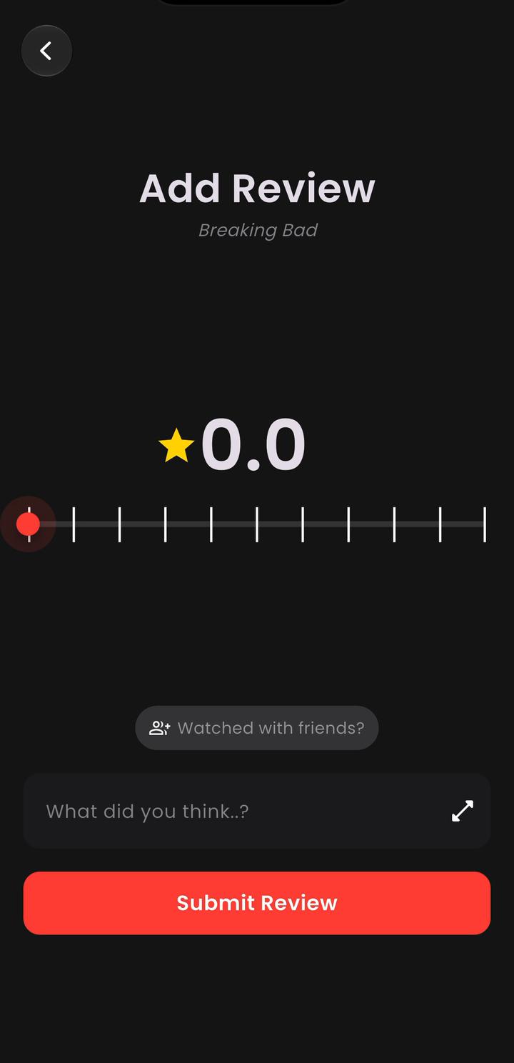
Reelate’s rating slider moves from 0.0 to 10.0 without opening a keyboard.
Video unavailable. A still image is shown.
Sometimes it’s
an 8.3.
A whole number doesn’t always match how you feel about a movie. I chose 0.0–10.0 with decimals so people could be specific, without typing a number into a fiddly little field.
I’d rather hear
from a friend.
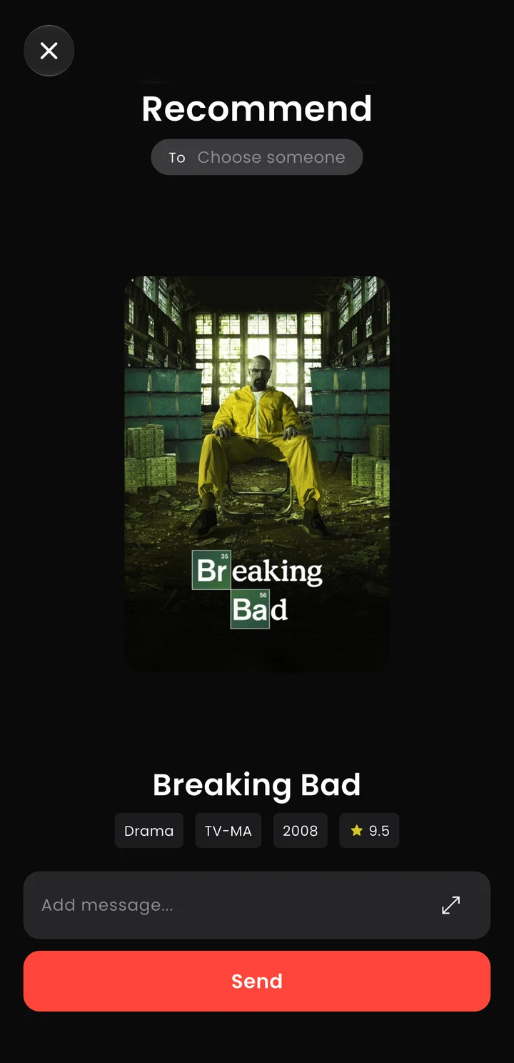
A recommendation from someone I know means more to me than a generic list. I wanted Reelate to keep that personal part, so you can send a movie to a friend and add why you think they’d like it.
DoorList.
Spotify, inside
the event playlist.
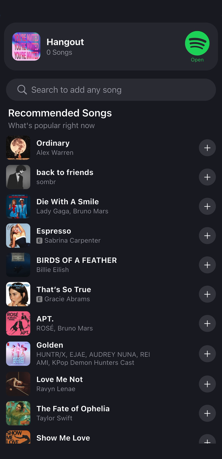
At DoorList, I built the Spotify integration so people could add music to an event’s playlist without leaving the app.
A small sign
that it worked.
After you add a song, its title briefly turns green, then fades back to white. I wanted the app to acknowledge what you just did without stopping you from picking the next song.
The “Added” label stays there after the color fades, so you can still tell which songs you’ve picked.
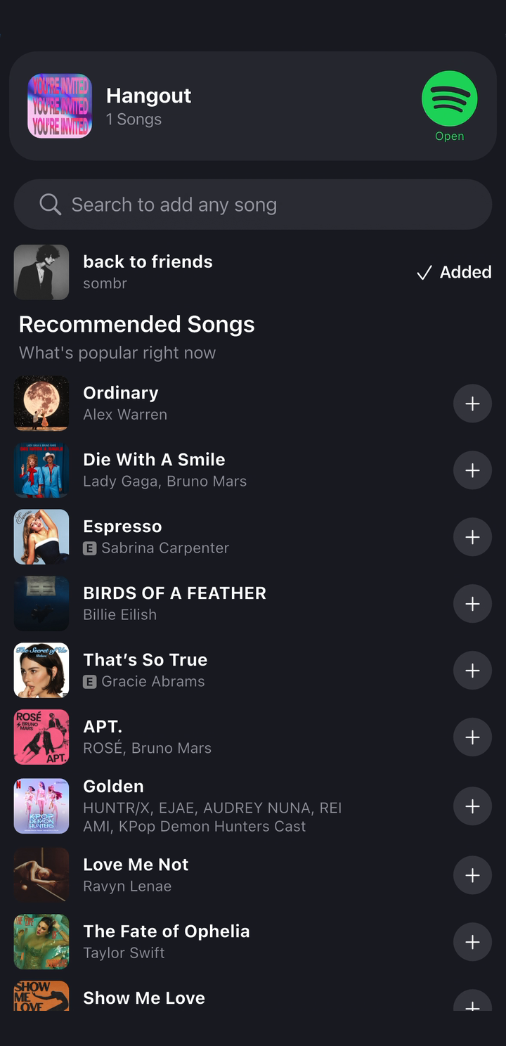
A song moves from recommendations into a DoorList event playlist. Its text briefly turns green, then returns to white while the Added label remains. Plays at original speed with a short hold between loops.
Video unavailable. A still image is shown.
Pilot.
Pages and
suggestions.
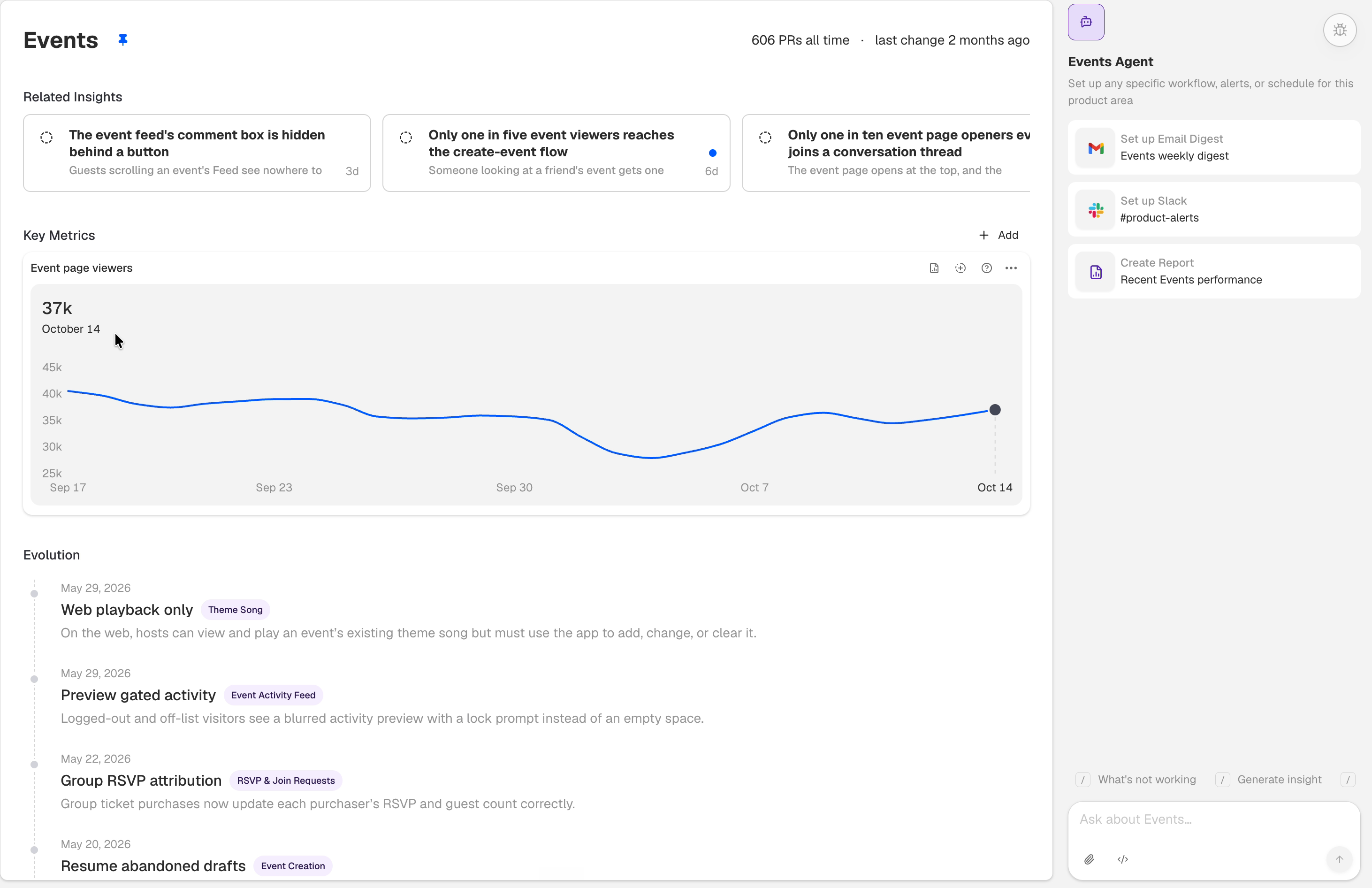
At Pilot, I built the frontend and backend for pages that bring related insights, metrics, and product changes together, and reworked the suggestion engine to use multiple agents. These are a few of the small interactions I care about in the product.
A little movement
in the sidebar.
A moving gauge or a few redrawn lines won’t change what a sidebar does. But those little moments can make it more enjoyable to use. I care about getting them right without making the rest of the page move around.
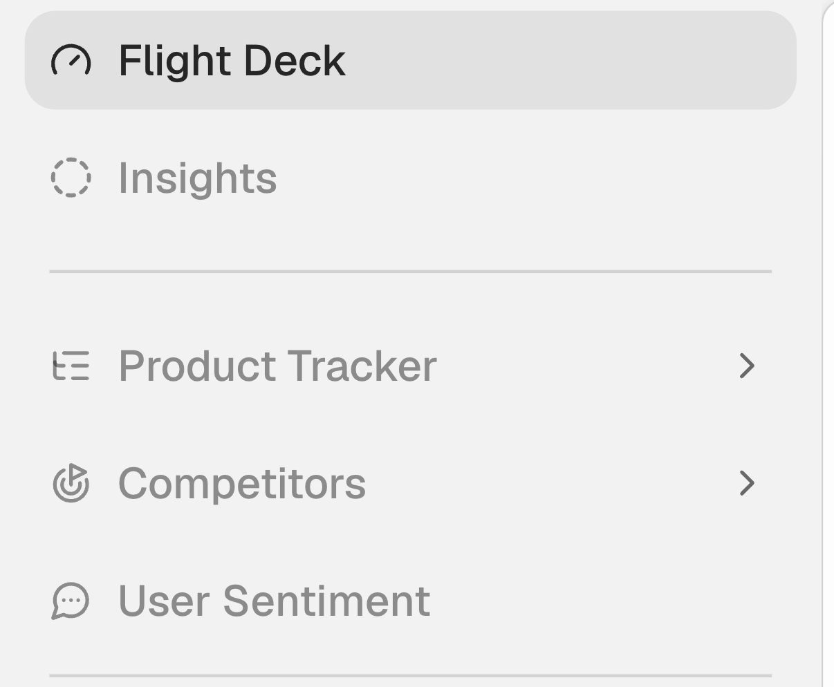
Pilot’s sidebar gauge needle moves, then the product tracker icon redraws its lines. Labels and layout remain steady. Plays at original speed with a short hold between loops.
Video unavailable. A still image is shown.
The tooltip shouldn’t
jump around.
When you move between points, a tooltip has to keep up without becoming distracting. Here, it slides to the next value and fades out when you leave, so it stays easy to follow.
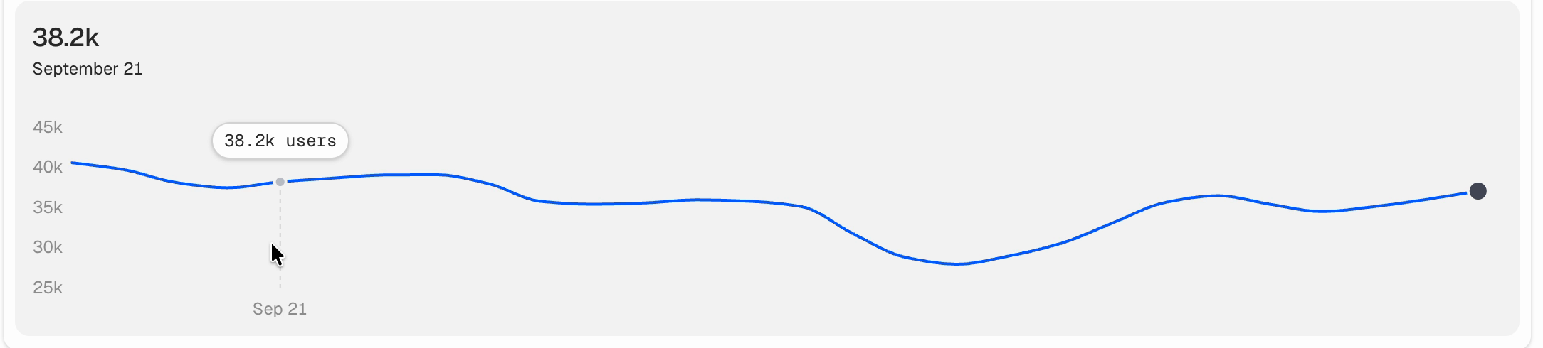
A chart tooltip moves from a settled point on the left to a point on the right, then fades away while the chart remains in place. Plays at original speed with a short hold between loops.
Video unavailable. A still image is shown.
A sidebar that
doesn’t jump.
An expanding sidebar group needs more space. Letting the rows below move with it makes the change easier to follow than having everything jump to a new position.
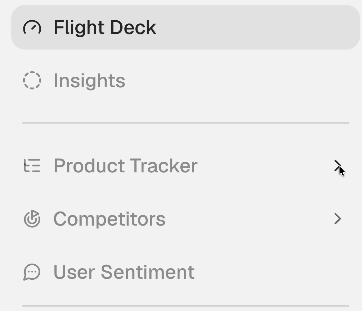
The Product Tracker group opens and closes. The neighboring sidebar rows move with its height. Plays at original speed with a short hold between loops.
Video unavailable. A still image is shown.
Notifications without
leaving the page.
Checking notifications doesn’t need to take over the whole page. The inbox and its filters open on top of the workspace, so you can narrow things down without losing your place.
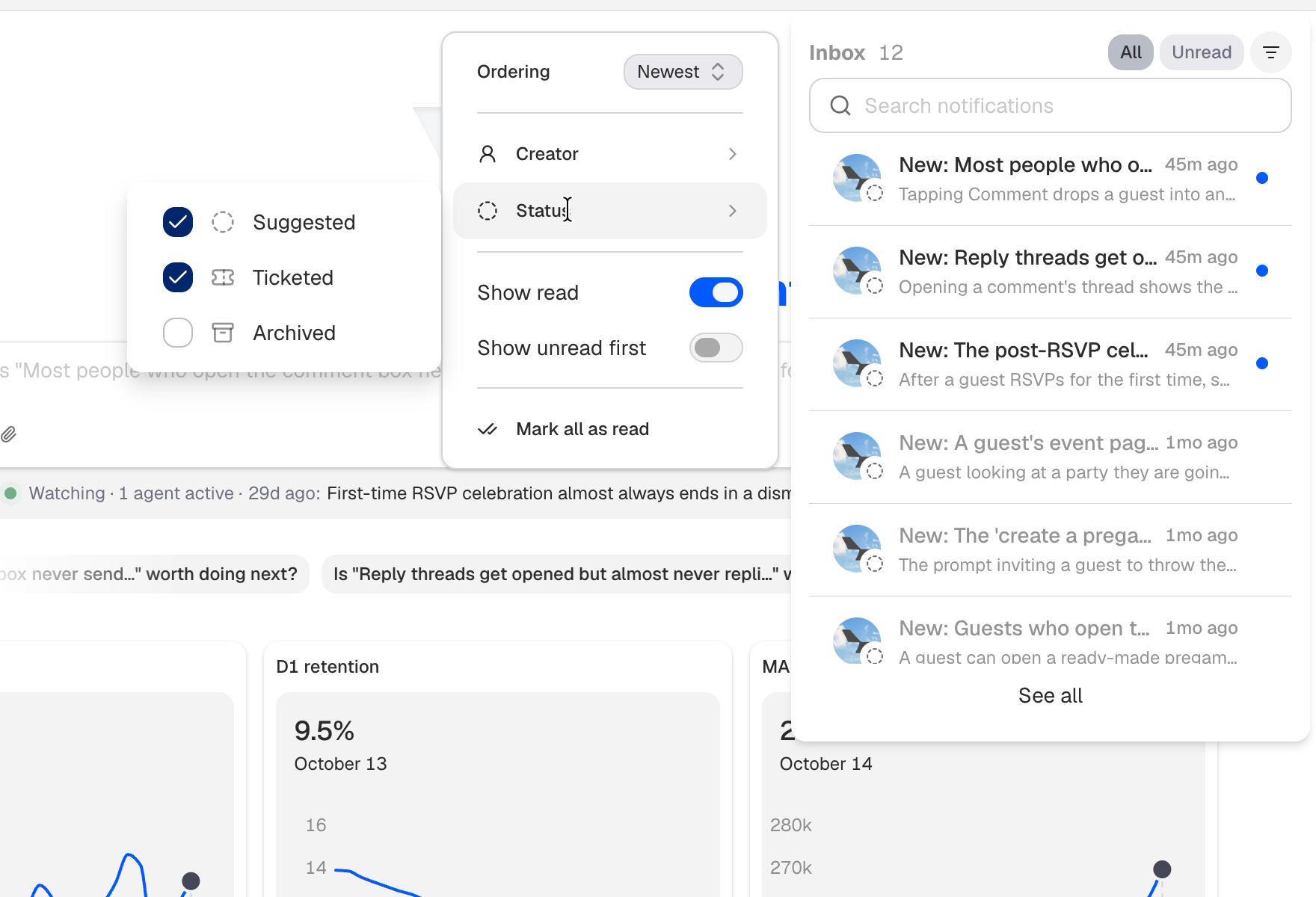
The inbox and filter panel appear over the workspace. In the Status submenu, Suggested and Ticketed are checked. The clip shows two parts of the interaction at their original speed. Plays at original speed with a short hold between loops.
Video unavailable. A still image is shown.
One place
to find things.
When you know what you’re looking for, it helps to have one place to start. The command palette brings areas, insights and navigation together, with groups that make the choices easier to scan.
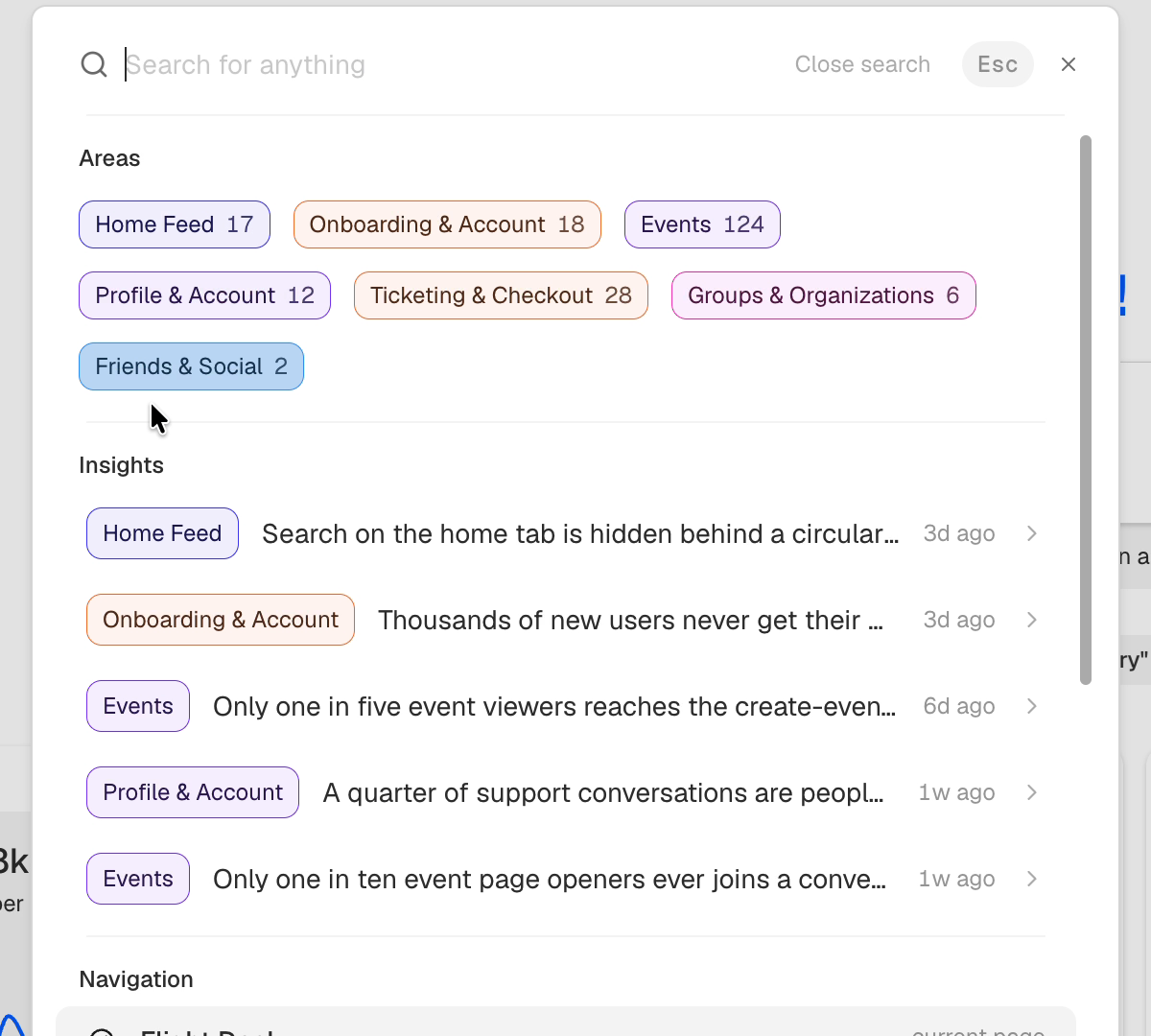
Pilot’s command palette groups areas, insights, and navigation. The pointer moves through the choices as the list scrolls down and back up. No destination is selected. Plays at original speed with a short hold between loops.
Video unavailable. A still image is shown.
What’s happening
while you wait?
I like being able to follow a request while it’s running. The loading animation and status cards help with that. The insight is still being generated in this clip.
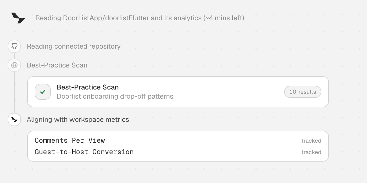
During insight generation, Pilot’s loading mark animates beside its status. A card appears, its searching label changes to a checkmark and result count, and the next status card arrives. The insight is still being generated when the clip ends. Plays at original speed with a short hold between loops.
Video unavailable. A still image is shown.
The Lion.
A restaurant in
our fraternity house.
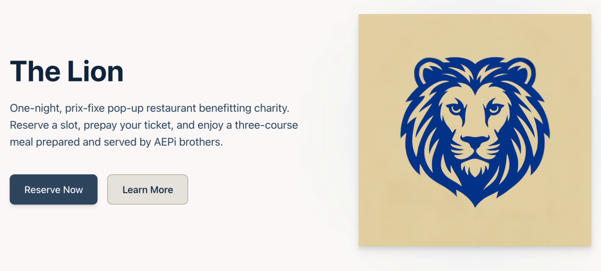
For an AEPi fundraiser, we turned our house into a restaurant for a night. I built the website and the tools we used to run it.
Different jobs need
different screens.
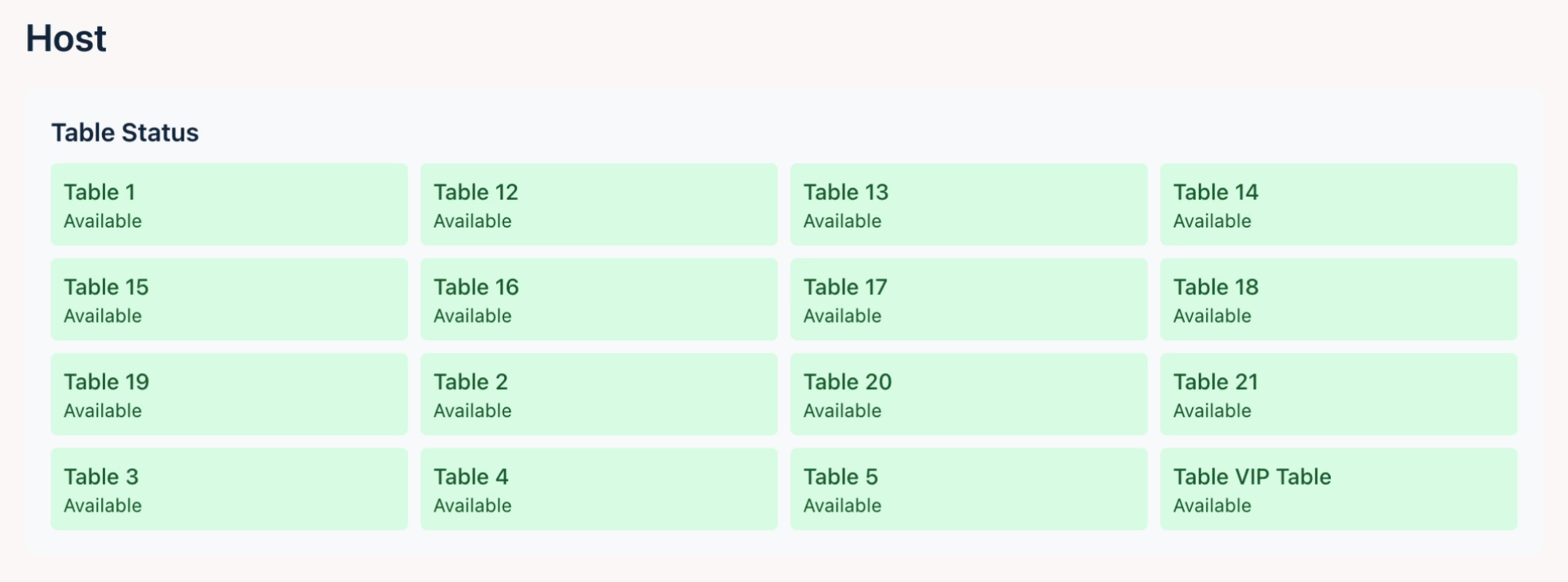
The host needs to see which tables are free. The kitchen needs to see the orders. I kept those views separate so each person could focus on what they needed to do.
Just the course
you’re working on.
I kept the table names and order status visible when filtering by course. That way, the kitchen can focus on one part of the meal and still see where each order belongs.
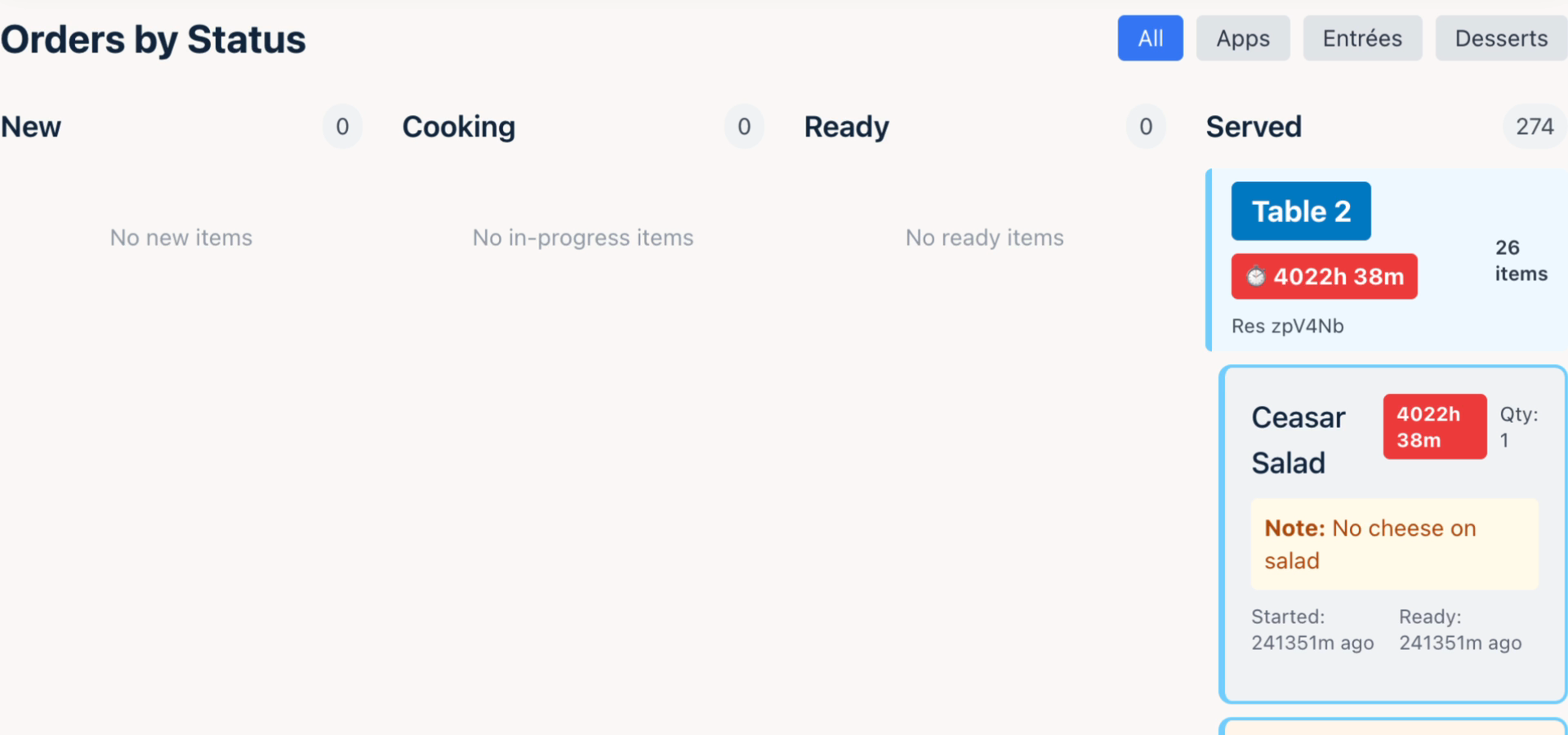
The Lion’s kitchen filters switch from All to Apps, Entrées, and Desserts. Queue and table item counts change while the status columns and Table 2 heading stay in place. Timers in this archived recording are out of date. Plays at original speed with a short hold between loops.
Video unavailable. A still image is shown.
No need to memorize
the drink menu.
Each drink ticket includes the recipe, so the person making it can check the ingredients and amounts without leaving the order. It also makes the view useful to someone who’s still learning the drinks.
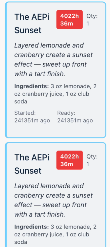
A close view of The Lion’s bar tickets, scrolling from the AEPi Sunset to the Lion’s Mane Mule. Each ticket includes its ingredients and quantities. Timers in this archived recording are out of date. Scroll down to advance, up to reverse, and stop to hold the frame. Page Up, Page Down, and the arrow keys also move through the demo.
Video unavailable. A still image is shown.